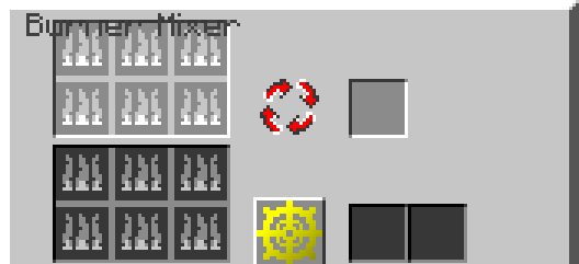
Critical lack of GUI space leads to text being placed over the input slots.
3 Likes
Lack of overall Space in the Default Resolution will not really make that possible…
2 Likes
Would it be possible to add extra space on top for the name, or is 1.7 too limited.
Or what about moving the name to the right?
2 Likes
It must be replaced by a version in Comic Sans, which is bright red and blinking.
Give it those 0.8 Web early 90’s vibes.
3 Likes
Yeah it really is limited to this very specific size, even double chests violate that size limit, because Mojang is so damn competent.
2 Likes